

Something big
is coming


June 17, 2026
The outfit we put on to meet you
How we built a brand for what knowledge work should look like.
By Aliza Edelstein, VP Product Marketing & Brand
You walk through any museum of modern art and someone invariably says "my toddler could do this." My thought is, well… they didn’t. And also, what makes art significant is the context it lived in, the moment it spoke to.
There's something true about art that's also true about brand. The best brands are the ones that read the moment clearly, and say something true in the language the moment understands. Part of the creative role in building Scribe’s brand was identifying the parts of the zeitgeist that mattered, knowing which ones would age, and which ones signaled something enduring. That's what we set out to do. I want to show you what we made, and how we made it.
There are hundreds of microdecisions that go into a brand’s visual identity, and each one comes back to the same question: when we say this is built for a specific audience, what does that actually mean for them?
Those people are out in a constant stream of content, every day, all day. The job is to create something that feels harmonious with that stream but still stands out, something distinctive enough to stop the scroll without being jarring. You want to pull people in, but you can’t do it by being weird (especially when speaking credibly to enterprise exec buyers). Every iteration of Scribe’s visual identity came back to one test: does this authentically tell our story in a way that the right people will hear it?
Most people can’t articulate why something works. It either does or it doesn't. They'll say "I don't like this" and give a reason, and that's okay, because it’s not for them. The audience we're designing for is our customers today, and the customers we haven't met yet. The leaders and teams who believe work should be better. The ones out in the world, waiting for us.
This brand is the outfit we put on to go meet them.
Creating something honest
We did not start this project trying to build something beautiful. We started it trying to build something honest about who we are and what we see.
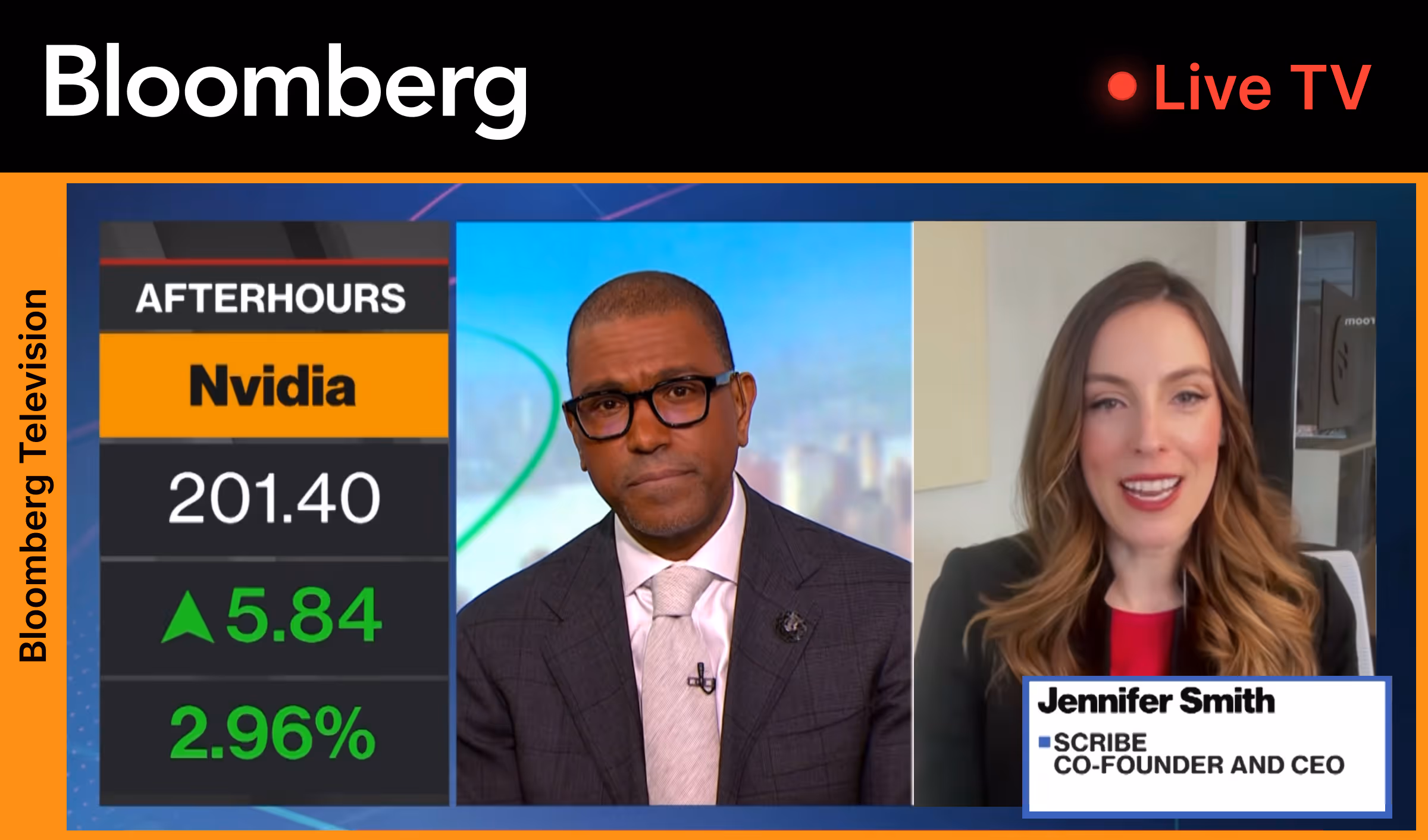
Scribe is building the future of knowledge work. We sit at the center of one of the biggest shifts happening in how organizations operate: the arrival of AI powerful enough to transform companies, but only if those companies can explain themselves clearly enough for it to work. As our CEO Jennifer Smith wrote in her announcement, we're building the tools that will finally make organizations legible — to their people, their AI, and themselves.
That’s not a small idea, and our previous visual brand identity was no longer nuanced or original enough to carry it. Our logo signaled "tech" but nothing else, and was paired with a rainbow gradient color palette that not only seemed to be everywhere, but also (most importantly) didn’t match us or our customers. Our customers are leaders who believe organizational excellence isn't a one-time project but a continuous state. The brand needed to match their ambition. Our customers have always been serious, competent, sophisticated professionals. The brand needed to reflect them.

When you're refreshing a brand, you always look at the competitive landscape. But seeing what everyone else is wearing doesn't tell you what fits. So the first decision was philosophical: we weren't going to blindly follow the "AI design playbook." We were going to use it, selectively, deliberately, and only where authentic to us.
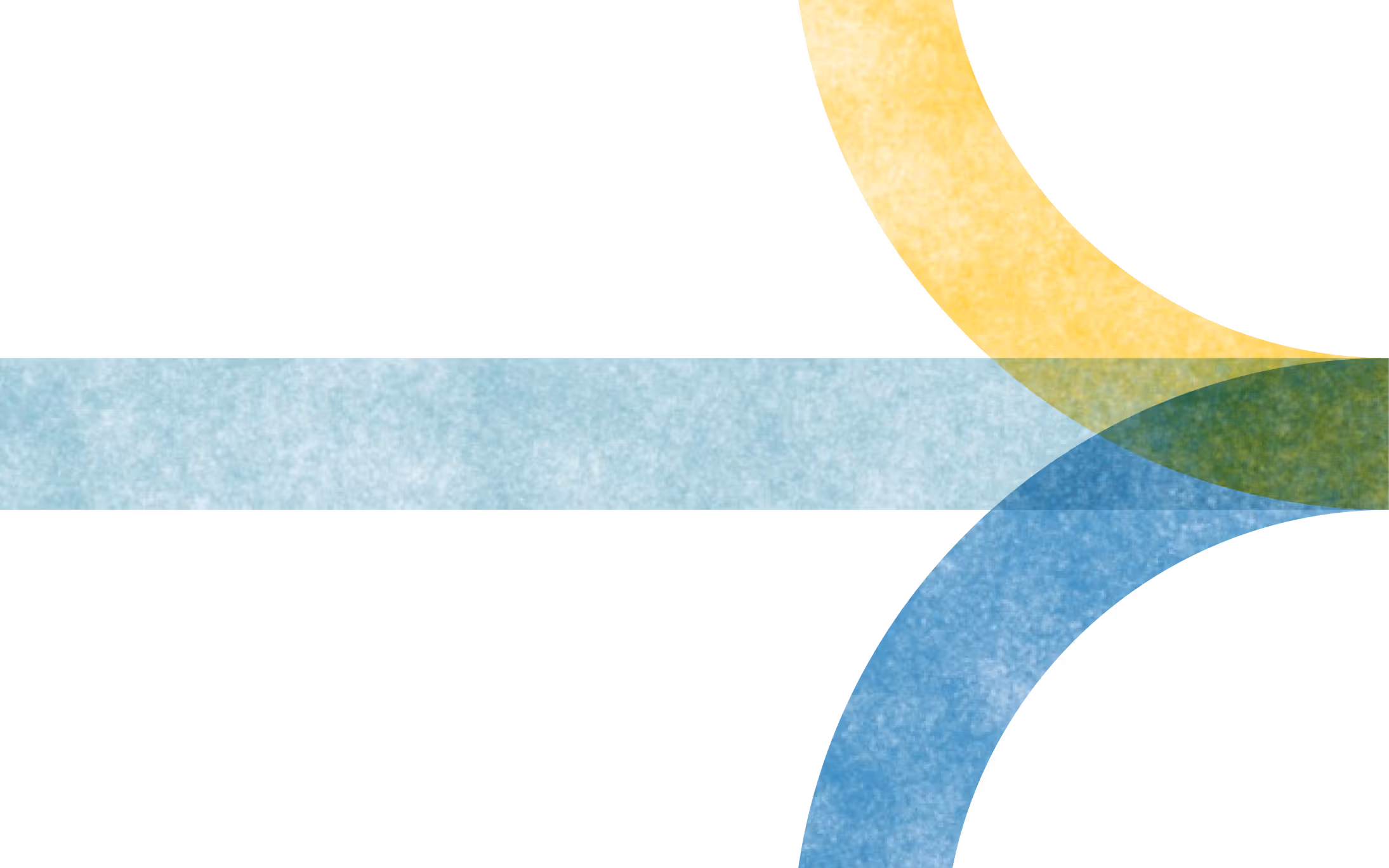
Early in the project, we audited every bleeding edge AI-native brand and asked: what are the rules of this genre right now, and which ones should we break? The risk of pulling from the full menu is that you age fast. The purple glow, the glass morphism, and the mesh gradient were everywhere, and already starting to feel like what they were: signals from two years ago.
We needed something distinctive enough to break through a very noisy world, something sophisticated enough to reflect the products we build and the customers we serve, and something that was built to endure.
The one rule we kept was high contrast. It's clear, confident, and legible. The rest, we reimagined.
The system: an exchange of information
Most design systems describe. Ours predicts.
Every dot in our visual language is a node. A person, a piece of knowledge, an AI agent, a moment in a workflow. On its own, it’s just potential. What makes it meaningful is what happens between the dots: the lines show those nodes in relationship, context and institutional knowledge passing from one person and AI agent to the next, workflows connecting across a team, information flowing through a system.

The system is designed to feel like something is happening. It’s not static. Dots are people and AI agents and moments of work. Lines are the connections between them, the handoffs, the context in motion. When color moves through the system, that's Scribe working. The whole visual language is one answer to a single question: what does it look like when an organization can finally understand and improve itself?
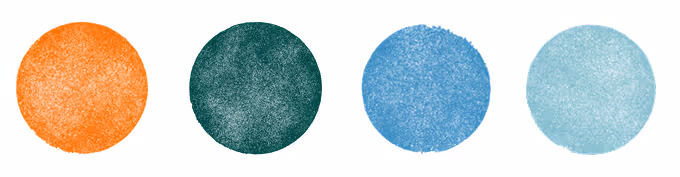
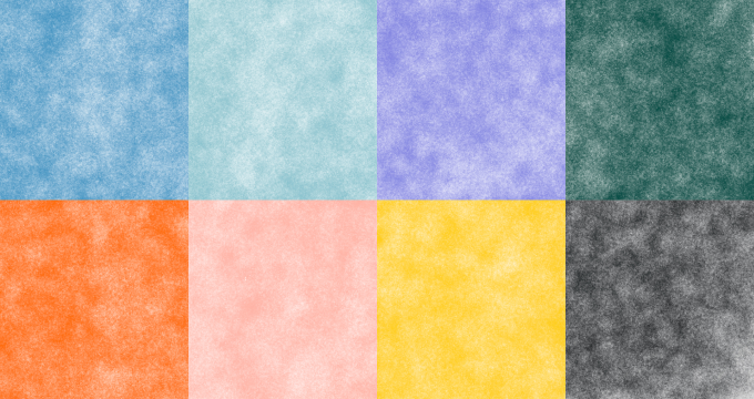
What makes the system distinctive is that the dots are not perfect. They're hand painted. Watercolor on an iPad, artfully created exactly the way that high value work is done.
In review after review, this was the element that stopped the room. Our incredible agency partner and design lead, Martin Grasser, described it as feeling "malleable, still wet when you put it down, not done yet." And it holds two truths at once: work is an innately human thing, and the intelligence that runs through it — the grid that organizes it — can be both human and AI.
Today, evidence of a human hand can feel subversive, almost like a glitch in the matrix. We noticed a pattern emerging, a move away from the perfectly manufactured surfaces of glass morphism and toward something more organic, more referencing craft and touch. Old maps. Oil painting. Woven textures. In an effort to escape the slop mill, handmade is having a moment. We found a way to make it ours.
Our main dot pattern for the system contains 1,600 hand-drawn dots, each one slightly different, each one painted by hand. Most people will never know this; they’ll just feel it. And that’s the point. There's something intentional in that choice that goes beyond craft: work is made of individual moments and individual people, and every dot in the system is an acknowledgment of that. It recognizes everyone making work that matters. It reflects the context and knowledge people carry in their heads as real and valuable and worth something. Every dot is a moment where knowledge flows from where it lives to where it's needed. That's not a small thing. That's the whole thing. This is our way of showing that.

The logo: a bouillon cube of the whole idea
The further we got into developing the design system, the more a different question started to emerge: could our logo do more? Our existing mark was fine. People’s feelings about it were neutral, like a shoulder shrug. It wasn’t unloved exactly, but it wasn’t sacred either. Our customers’ effusive love for Scribe was almost entirely about the product, and no one had strong feelings about the mark itself. It signaled tech. It did not signal us.
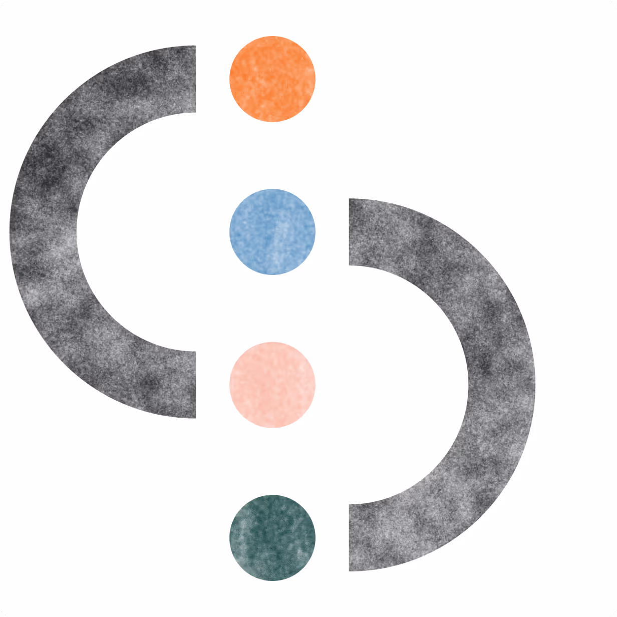
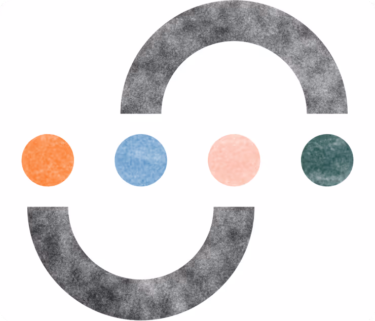
What we found, after endless sketches and a lot of attempts that almost worked and then didn't, was the Connected S.

Describing why a logo works is a little bit like describing why a joke is funny. I’m going to do it anyway, but I’ll start by admitting that there's a science to it as much as there are vibes. We went partially off vibes here, and when the Connected S came together, the room felt it before anyone could explain it. It was us, compressed into a single shape.
The Connected S takes the logic of the whole system and compresses it into a single shape: two forms, each a magnet. Two nodes, and the space between them. Together, completely unforced, appears an S.

Graphic designer Saul Bass wrote that a logo should be a metaphor for the main activity of the company. The Connected S has a start and an end. There is an exchange. Something begins, something is processed, something new, more complete, and better emerges. That is what Scribe does.
At small sizes, the logo sings. The eye completes the S in a way that feels like an optical illusion, a kind of discovery. There is inherent speed in the wrapping of the forms, a sense of motion even at rest. The variation in the curve widths gives it informality and warmth, the sense that something alive is inside it. In its animated state, color moves through it, like a thought being completed.
It’s processing. It’s thinking. Pin it in your browser extension lineup, and you won’t miss it.
Color and type: it's a phthalo world and we're all just living in it
AI is living in a palette of bright, saturated blues and purples, the high-energy visual language of ambition and speed. We went the opposite direction: natural, soothing colors grounded in warmth and authenticity, accenting a high-contrast base of near-black, white, and "AI greige," an omnipresent light gray that reads intelligent without overreaching.
Not because we wanted to be quiet, but because confidence does not always shout. Every color decision came back to the same question: what does it say about the work? Ours and our customers'. Our customers are not the loudest people in any room. They're the most competent. The palette reflects that.
Color in our system is not wallpaper. It appears in specific moments: an icon in motion, a workflow being completed, a highlight of something important, confetti when the magic can’t contain itself. When color shows up, that's Scribe working.
Our serif type has calligraphic warmth, with the thick and thin contrast of something drawn by hand, elevated without being cold. Our sans serif is its partner, the workhorse, clear and direct. Together, they’re warm, bold, and confident.
How the work actually got made
The answer was not born in a briefing room. It was born from the work.
16 weeks. Nearly 50 working sessions between me, Martin Grasser, and Audrey Chen at And Repeat, and creative reviews with our cofounders, head of Marketing, and head of Design. That number doesn't include the after-hours texts, the Figma links dropped with a note that just said "look at this."
Like I said at the beginning, most people can’t articulate why something works. It either does or it doesn't. We worked on this until it worked. The Connected S emerged from sketches. The watercolor dots emerged from a session in Procreate where Audrey suddenly had something and we all knew it. The dot grid came together and Marty texted: "the dot grid is genius." These things are not invented, exactly. They’re generated. You make the conditions for them to appear, and then you keep working until they do.
We continued to push the work toward something honest. We knew we were done when we could step back, see all the pieces working together, and both think and feel: now this is us.
What comes next
We’re at a genuine inflection point, the kind that usually only looks obvious in hindsight but that AI has made so profound that you know it’s happening right now. The AI era has arrived but most organizations are still catching up to what that actually means for how work gets done. That's the moment this brand was built to live in, and outlast.
A great brand system is not a moment. It's a repeatable language, one that every employee becomes a steward of, that scales from a browser extension to a billboard to a slide deck to our newest crewneck, and stays coherent across all of it. That's what we built. Dots and lines. Agentic action and connection. An exchange of information.
This brand was built for people who believe knowledge work can be better, by people who believe the same thing. In five years, when knowledge work looks different, when organizations that fully understand themselves are the norm rather than the exception, this system will still be able to showcase what Scribe stands for. Because it doesn't describe a product. It describes a philosophy.
We went out and found the parts of the zeitgeist that were true. We built something that belongs to this moment. And we will lead what comes next.